


Focus
Focus manages element focus in forms. By default first visible and enabled input element(e.g. text, textarea, select) is chosen to receive focus automatically. It is also possible to explicitly declare the component to receive focus via the for attribute. Focus is also aware of failed validations, first invalid input component receives a focus automatically.
DocumentationFREE THEMES
Built-in component themes created by the PrimeFaces Theme Designer.
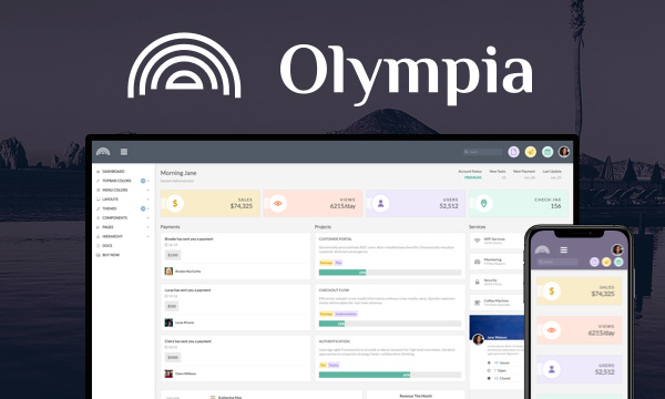
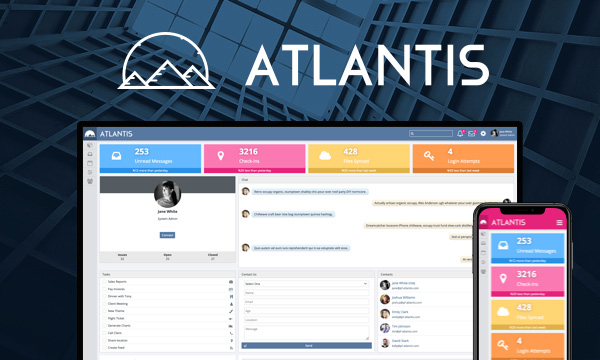
PREMIUM TEMPLATES
Create awesome applications in no time using the premium templates and impress your users.